
Effective engagement reporting tells you exactly where participation is leaking across four lifecycle stages: Reach, Attention, Action, and Loyalty. Every report your team produces should deliver four outputs: stage health scores, the top-leaking stage, one prioritized intervention, and the expected KPI lift from that fix. The single diagnostic to run right now is participation rate by cohort — active participants divided by eligible workforce, broken out by department and tenure band.
TL;DR for the C-suite:
- Map every metric to a lifecycle stage, not just a total count.
- Identify the one stage where drop-off is steepest and intervene there first.
- Validate every intervention against a control group to prove lift.
- Frame results around participation rate growth and charity dollars generated, not raw miles.
Table of Contents
- What does engagement reporting actually measure across the lifecycle?
- How do you turn a report signal into a real intervention?
- Why universal participation targets mislead your program managers
- What data sources and privacy steps does your program need?
- Which dashboards should you build, and how often should you review them?
- How do you link engagement data to ROI and CSR impact?
- How do you go from baseline to a scaled program in 6 steps?
- Key Takeaways
- The blind spots most programs never fix
- Charitymiles makes lifecycle-driven reporting practical
- Useful sources and further reading
What does engagement reporting actually measure across the lifecycle?
Engagement reporting organizes participation data into four stages: Reach (who knows the program exists), Attention (who explores it), Action (who joins and moves), and Loyalty (who stays active month over month). Each stage needs its own KPIs, because a healthy total can hide a collapsed middle.
| Stage | KPI | How It’s Measured | Why It Belongs Here |
|---|---|---|---|
| Reach | Awareness rate | Enrolled employees / eligible workforce | Shows communication penetration |
| Attention | App open rate | Sessions per enrolled user (first 7 days) | Signals onboarding friction |
| Action | Team challenge join rate | Challenges joined / active users | Measures conversion to social participation |
| Action | Miles logged per participant | GPS/pedometer data, weekly | Tracks depth of activity |
| Loyalty | 90-day retention rate | Active users in month 3 / month 1 cohort | Leading indicator of culture stickiness |
| Loyalty | Donation dollars generated | Sponsorship × miles, cumulative | Ties activity to CSR impact |
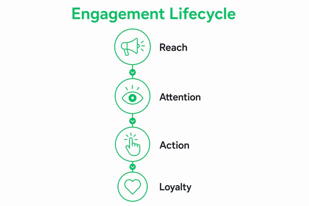
A weak Attention stage with strong Reach almost always signals a messaging mismatch: employees heard about the program but saw no personal reason to open the app. A strong Action stage with poor Loyalty usually points to a missing social hook — people moved during a challenge, then stopped when it ended. Reading the lifecycle lens this way lets you fix the right problem instead of chasing aggregate totals.
How do you turn a report signal into a real intervention?
The signal-to-action loop runs in four steps: detect a signal, analyze the affected segment, intervene with a targeted treatment, then measure lift against a control group. Here is how that plays out in practice.
- Signal: Team challenge join rate drops 18% in the second month of a new program cohort.
- Analyze: Segment by department and tenure. New hires (under 90 days) show a 34% lower join rate than established employees.
- Intervene: Send a personalized in-app nudge to new hires featuring a low-barrier “First Mile” challenge with a $5 donation match.
- Measure: Compare join rate and 30-day retention for the nudged group against a randomly held-out control group over a 4-week window.
Measurement plan:
- Hypothesis: A targeted onboarding nudge increases new-hire challenge join rate by at least 10 percentage points.
- Treatment group: New hires who receive the nudge.
- Control group: New hires in a comparable department who do not.
- Primary metric: Challenge join rate at day 30.
- Evaluation window: 4 weeks post-nudge.
Pro Tip: Pick your control group before you run the intervention, not after. Post-hoc controls introduce selection bias and make seasonal effects (like a company-wide wellness month) look like program lift. Randomize at the individual level whenever possible.
A practical trigger rule: if any segment’s join rate falls more than 15% below its prior 4-week average, the report should automatically flag it and create an intervention task assigned to the program manager.
Why universal participation targets mislead your program managers
Setting one participation target for the entire workforce masks failures in specific cohorts. A 40% overall participation rate looks fine until you see that new joiners are at 12% and your most tenured employees are carrying the average. Segment by lifecycle stage and depth of interaction instead.
| Segment | Definition | Primary Metric | Target Type |
|---|---|---|---|
| New Joiners | Enrolled < 90 days | App open rate, first challenge join | Growth threshold (week-over-week) |
| Regulars | Active 3–12 months | Monthly miles logged | Absolute floor (e.g., miles/month) |
| Champions | Active 12+ months, top quartile | Challenges created or led | Ambassador conversion rate |
| Passive | Enrolled but < 1 activity in 30 days | Re-engagement rate after nudge | Recovery rate |
| Lapsed | No activity in 60+ days | Reactivation rate | Win-back rate |
Champions deserve a different program entirely — ambassador challenges, peer-to-peer fundraising goals, and internal recognition — rather than the same onboarding nudge you send new joiners. Passive and Lapsed segments need re-engagement campaigns, not more awareness content. Growth targets work best for early-stage segments; absolute thresholds work better for established ones.
What data sources and privacy steps does your program need?
Reliable engagement analysis pulls from at least four systems: the activity app (miles, sessions, challenge joins), your HRIS (tenure, department, location), SSO or roster sync (eligibility and unique IDs), and a CSR donation ledger (funds generated per participant). Survey or NPS data adds sentiment context.
Integration checklist:
- Assign a unique, persistent employee ID that survives name or email changes.
- Sync timestamps to a single time zone (UTC recommended) before joining tables.
- Standardize event names across systems (e.g.,
challenge_joinednotChallengeJoinin one tool andchallenge-joinin another). - Deduplicate activity records when GPS and pedometer data overlap.
Privacy and consent checklist (US enterprise):
- Obtain explicit opt-in for activity tracking; do not infer consent from app download alone.
- Minimize PII in reporting tables — use anonymized IDs for analysis, names only in manager-facing views with role-based access.
- Set data retention windows (90 days for raw event logs is a common enterprise standard).
- Review vendor data processing agreements annually, especially for any nonprofit CRM integrations that handle donation records.
- Document your data steward and decision owner for each reporting cadence.
Which dashboards should you build, and how often should you review them?
Program managers and executives need different views. Giving an executive a raw event log is as unhelpful as giving a program manager only a single health score with no drill-down.
Recommended cadence:
- Weekly (program manager): Challenge join rate, active users, miles logged, new-joiner onboarding funnel.
- Monthly (program director): Participation rate by segment, retention cohort curves, donation dollars, intervention outcomes.
- Quarterly (executive): Composite health score (weighted blend of participation rate, consistency, and community-building), year-over-year trend, CSR impact summary.
| Dashboard Layer | Key Metrics | Visualization Type |
|---|---|---|
| Executive | Health score, participation rate, donation total | Single-number scorecard + trend line |
| Program manager | Funnel by stage, segment breakdown, challenge activity | Funnel chart + cohort bar chart |
| Analyst | Event matrix (frequency vs. % active users), lifecycle state transitions | Engagement scatter plot, cohort lifecycle bars |
Cohort lifecycle bar charts — showing new, retained, expansion, and churned states by month — make it immediately obvious when a program is losing momentum versus growing organically. Funnel charts expose the Attention-to-Action gap at a glance.
How do you link engagement data to ROI and CSR impact?
Engagement metrics are leading indicators of retention and culture health, not vanity totals. A rising participation rate predicts lower voluntary turnover before it shows up in exit interviews. Framing reports around active participants, participation rate growth, and funds generated for charity builds a narrative executives can act on.

Gallup research shows companies with highly engaged employees are 21% more profitable. When you can show that a 10-point lift in participation rate correlates with a measurable drop in 90-day attrition in a control-group study, you have a defensible ROI story. Pair that with donation impact — dollars generated per active participant — and the corporate wellness investment pays for itself in the narrative, not just the spreadsheet.
How do you go from baseline to a scaled program in 6 steps?
- Define objectives. Agree on 2–3 business outcomes (e.g., reduce 90-day attrition by 5%, generate $50,000 for charity in year one).
- Map KPIs to lifecycle stages. Use the table in Section 2 as your starting template; adjust thresholds to your workforce size.
- Instrument events. Confirm unique IDs, timestamp sync, and event naming across all data sources before launch.
- Pilot with 1–2 teams. Run a 6–8 week pilot with a treatment group and a matched control group; track the primary metric weekly.
- Run interventions and measure lift. Apply the signal-to-action loop; document hypothesis, treatment, and outcome for each intervention.
- Scale with governance. Assign a data steward and a decision owner for each reporting cadence before expanding company-wide.
| Phase | Timeline | Milestone |
|---|---|---|
| Baseline & setup | Weeks 1–2 | KPIs defined, data sources connected |
| Pilot | Weeks 3–10 | First intervention tested, control group established |
| Evaluation | Week 11 | Lift measured, report shared with leadership |
| Scale | Weeks 12–16 | Program expanded, quarterly executive cadence live |
Key Takeaways
Lifecycle-driven engagement reporting turns participation data into a prescriptive tool: map metrics to each stage, find the leak, intervene, and measure lift against a control group.
| Point | Details |
|---|---|
| Map metrics to lifecycle stages | Assign KPIs to Reach, Attention, Action, and Loyalty rather than tracking aggregate totals. |
| Use the signal-to-action loop | Detect a drop, analyze the affected segment, intervene with a targeted treatment, and measure against a control. |
| Segment before you set targets | Universal participation targets hide underperforming cohorts; use New Joiner, Regular, and Champion segments with stage-appropriate thresholds. |
| Lead with participation rate | Report active participants divided by eligible workforce, plus donation dollars generated, to build an executive-ready narrative. |
| Charitymiles for lifecycle reporting | Charitymiles’ Employee Empowerment Program tracks challenge joins, miles, and donation impact by team — the core data for every lifecycle stage above. |
The blind spots most programs never fix
The programs I see stall most often share one trait: they measure outputs instead of transitions. A team logs 50,000 miles in month one and leadership celebrates. But if 60% of those miles came from 10% of participants, the Loyalty stage is already hollow — and no one noticed because the headline number looked strong.
The second pitfall is treating the pilot as the proof. A 6-week challenge with no control group tells you that people moved; it does not tell you that your program caused it. Seasonal wellness campaigns, benefits open enrollment, and manager enthusiasm all inflate numbers during a pilot window. The leaders who fix this run a proper holdout from day one, even if it means a smaller treatment group. The data is cleaner, the ROI story is defensible, and the executive conversation gets much easier.
Charitymiles makes lifecycle-driven reporting practical
Charitymiles’ Employee Empowerment Program gives HR and CSR teams the data infrastructure the lifecycle framework above requires: private team dashboards, challenge join rates, miles logged per participant, and donation dollars generated — all in one place. HARMAN’s 11x participation increase and $120,000+ in charity impact came from exactly this setup: structured team challenges, configurable sponsorship, and reporting that connects activity to CSR outcomes.
For teams evaluating their current employee engagement software, Charitymiles integrates with HRIS and SSO systems to keep your unique IDs and roster data in sync, so your lifecycle dashboards reflect the real eligible workforce, not just app downloads. The program is free for employees and free for charities — your cost is the sponsorship you choose to fund.
Ready to see what lifecycle-driven reporting looks like for your workforce? Explore the Employee Empowerment Program and request a demo.
Useful sources and further reading
- Engagement Metrics: Definition, Types & How to Measure — lifecycle stage definitions and KPI mapping methodology.
- Customer Engagement Analytics Guide — signal-to-action loop, segmentation best practices, and composite health scores.
- Engagement Analysis — Adobe Customer Journey Analytics — visualization patterns for frequency vs. depth of use.
- Engagement Analysis Templates — Reforge — cohort lifecycle bar chart templates and SQL frameworks.
- Charitymiles Employee Empowerment Program — platform capabilities, HARMAN case study, and enterprise reporting overview.
- Corporate Wellness ROI Blueprint — framework for linking wellness program investment to measurable business outcomes.
- Employee Engagement Best Practices — practical program design guidance for HR leaders.
- CSR Initiatives for Engagement — strategies for connecting CSR activities to measurable participation metrics.