
The strongest CSR reports share three traits: they focus on outcomes tied to real evidence, they align with recognized frameworks, and they present data in a way stakeholders can actually use. The Global Reporting Initiative sets the baseline for disclosure, Salesforce’s FY26 report shows what double materiality and independent assurance look like in practice, and Sopact’s Five-Question Test gives you a fast way to check whether your own draft actually proves impact. Start by scanning the annotated examples below, then map one or two material topics to real metrics.
TL;DR:
- Most effective CSR reports focus on measurable outcomes, use recognized frameworks, and present data in ways stakeholders can verify and act on.
- Building a strong report requires including leadership messages, governance details, clear strategy, trend data visualizations, and impact stories tied to tangible metrics.
- Benchmark examples like Salesforce, Amazon, BMW, and others demonstrate best practices in disclosure, design, stakeholder engagement, and framework alignment.
- A combination of static PDFs for regulatory needs and web-based interactive formats for stakeholder engagement maximizes impact, with design simplicity and easy navigation.
- Prioritizing a materiality assessment, running data through the Five-Question Test, and ensuring claims are supported by primary sources are key steps for credibility.
Table of Contents
- What Belongs in a CSR Report
- Six Reports Worth Studying, and What to Steal From Each
- Choosing Between an Interactive Report and a PDF
- Which Framework Should You Reference
- Running a Materiality Assessment That Actually Prioritizes Topics
- Making Your Claims Defensible
- How an Employee Fitness Program Becomes a Reportable Outcome
- What I’d Prioritize If I Were Building This Report Today
- Turn Employee Movement Into a Reportable CSR Line Item
- Where to Go Next for Frameworks and Templates
- Sources
What Belongs in a CSR Report
Most CSR reports fail for a boring reason: they list activities instead of proving outcomes. A well-built report has a message from leadership, a clear table of contents, outcomes-based data, participant stories, and visuals that track trends over multiple years, according to research from Harvard Business School’s Working Knowledge. That structure isn’t decorative. Each piece answers a different question a skeptical stakeholder will ask.
Here’s what each section needs to carry, and the evidence that backs it up:
- Executive message: A short, specific statement of priorities from a named leader, not a generic mission recap. Vague optimism reads as filler.
- Governance: Who owns CSR data internally, how often the board reviews it, and what committee signs off on disclosures.
- Strategy: The two or three material topics you’ve chosen and why, tied to your materiality assessment (covered below).
- Performance indicators: Quantified metrics with baselines and targets, not just current-year snapshots. A single data point without a prior year is nearly unreadable.
- Case studies: Real participant or beneficiary stories, traceable to program records, not composite anecdotes.
- Methodology: Data sources, collection dates, estimation methods, and known limitations, stated plainly.
- Appendices: Raw datasets or links to them, plus a framework index (GRI, SASB, TCFD) mapping each disclosure to its standard.
For year-over-year trends, a simple line chart beats a paragraph of prose every time. Readers scan for direction: up, down, flat. If you can only show one visual per KPI, make it the trend line against a stated baseline and target, not a single-year bar chart that hides whether you’re actually improving.
Six Reports Worth Studying, and What to Steal From Each
You don’t need to reinvent report design. A handful of organizations have already solved the hard problems, and each one teaches a different lesson.
-
Salesforce FY26 Stakeholder Impact Report. This is the current benchmark for large-enterprise CSR reporting. Salesforce runs a formal double materiality assessment to decide what gets disclosed, aligns to IFRS/ISSB and SASB standards, and brings in third-party assurance (commonly performed by major audit firms) on selected metrics. What to copy: publish a short summary of your materiality process, even if it’s informal, and state clearly which numbers have been independently reviewed and which haven’t.
-
Amazon’s sustainability report. Amazon’s report covers an enormous range of topics, from carbon to labor practices to packaging, organized into a navigable topic index that links back to the frameworks it references. What to copy: build a simple table mapping each disclosure to its standard (GRI, SASB) so auditors and analysts can find what they need without hunting.
-
BMW and Meta’s report design (via Maglr’s gallery). Both companies have moved away from static PDFs toward web-first formats with clearer navigation and modular sections. Design examples collected by Maglr show that a scrollable, chaptered web report gets read further than a 100-page PDF that most stakeholders open once and abandon. What to copy: break your report into short, linkable chapters instead of one giant document.
-
Tony’s Chocolonely and Girls Who Code. Neither is a Fortune 500 giant, and neither needs to be. Both lead with mission-driven storytelling and put beneficiary voices near the top of the report rather than buried in an appendix. What to copy: open with the human outcome, then back it with the number, instead of the reverse.
-
ROC Amsterdam’s interactive report. Rather than a flat document, ROC Amsterdam built a scrollytelling experience that walks stakeholders through a journey instead of a static grid of stats. What to copy: if you have the design budget, pilot one interactive page for your highest-priority stakeholder group before committing to a full interactive rebuild.
-
Port of Rotterdam’s sustainability disclosures. Infrastructure and logistics organizations face unusually complex material topics (emissions, land use, community impact), and Port of Rotterdam’s approach to layering detail (summary first, drill-down data behind it) offers a model for readers with dense, technical disclosures. What to copy: use progressive disclosure. Don’t force every reader through the same depth of detail.
Notice what these examples have in common: none of them lead with a wall of text. Every one pairs a claim with a number, a story, or a visual, and the strongest ones (Salesforce, Amazon) name the framework behind each disclosure so a skeptical reader can verify it independently.
Choosing Between an Interactive Report and a PDF
A PDF still makes sense when regulatory completeness matters more than engagement. Filing something with a regulator or a bond investor almost always calls for a static, page-numbered, citable document. But if your primary goal is to get employees, customers, or community partners to actually read what you built, a web-first format wins. Interactive reports and scrollytelling formats consistently outperform static PDFs on stakeholder engagement, largely because they let readers self-select depth instead of forcing everyone through the same sequence.
Whichever format you choose, a few design rules hold regardless:
- Keep navigation shallow. Three clicks to any data point, maximum.
- Design mobile-first. Most stakeholders will open your report on a phone before a laptop.
- Make every chart traceable to its underlying data, even if that means a footnote linking to a downloadable spreadsheet.
- Embed short videos or audio clips of participant voices where you have them. Text alone underperforms.
- Offer a downloadable dataset or PDF export for readers who still need a citable, offline version.
Pro Tip: Before building a full interactive report, pilot one page with your highest-priority audience (employees or a key investor group) and watch how far they actually scroll. That single test will tell you more about format than any amount of internal debate.
Which Framework Should You Reference
Most organizations don’t pick one framework. They layer two or three depending on audience.
- GRI (Global Reporting Initiative): The broadest, most widely adopted standard for sustainability disclosure, covering environmental, social, and governance topics. Reference GRI Standards when your primary audience is general stakeholders, NGOs, or community partners.
- SASB/ISSB: Industry-specific and investor-facing. Choose this when your audience includes shareholders or analysts who want financially material ESG data benchmarked against peers.
- TCFD/IFRS: Focused on climate risk disclosure. Increasingly folded into ISSB standards, but still referenced independently by companies with heavy climate exposure.
- UN SDGs: Not a reporting standard so much as a mapping tool. Use SDG icons to show how your material topics connect to global goals; investors rarely require it, but community stakeholders respond well to it.
If you operate in the European Union, the Corporate Sustainability Reporting Directive (CSRD) may create mandatory disclosure requirements, and filling a generic template does not automatically satisfy those legal obligations, according to CSRD template guidance from Group GAC. CSRD doesn’t apply to every organization outside the EU, so check your own regulatory exposure before assuming it’s relevant. Most mid-size companies without EU operations can build credibility with GRI plus a light SASB reference, and add TCFD/ISSB only once climate risk becomes financially material to their business.
Running a Materiality Assessment That Actually Prioritizes Topics
A materiality assessment is how you decide what to report on before you decide how to report it. Skip this step and you’ll end up with a report that covers everything shallowly and proves nothing.
- Map your stakeholders. List employees, customers, investors, regulators, and community partners, then note what each group actually cares about (not what you assume they care about).
- Score topics on two axes. Rate each candidate topic by its importance to stakeholders and its financial or operational significance to your business. This is the “double” in double materiality: impact on the world, and impact on the company.
- Prioritize the top few. Most organizations report on far too many topics at shallow depth. Pick two or three where you have real evidence and real movement, and go deep.
- Align each topic to a metric. Every prioritized topic needs at least one quantifiable KPI with a stated baseline and target.
Once you’ve prioritized topics, run each planned disclosure through the Five-Question Test: what changed, for whom, compared to what baseline, with what confidence, and what decision does this evidence actually enable? A metric that survives all five questions is reportable. One that doesn’t is an activity log dressed up as impact.
Strong KPI examples include: pounds of carbon avoided against a stated baseline year, hours of volunteer time logged against a prior-year total, or dollars raised for a cause against a program launch benchmark. Weak KPIs state a raw number with no comparison point at all.

Making Your Claims Defensible
Every number in your report should trace back to a primary source: a utility meter, an HR/payroll system, a supplier invoice, or a participant survey. If a stakeholder or auditor asked “where did this number come from,” you should be able to point to the exact system, not reconstruct it from memory.
- Limited assurance means an auditor reviewed your methodology and found no reason to believe the data is materially wrong, but didn’t independently verify every underlying figure.
- Reasonable assurance is a deeper review, closer to a financial audit, and is far less common for sustainability metrics outside of carbon accounting.
- Estimation methods should be disclosed openly. If a figure is modeled rather than measured, say so and state the confidence range.
Third-party limited assurance over select environmental and employee metrics, the kind large audit firms perform for major corporates, is quickly becoming the practical minimum for credibility with sophisticated stakeholders. If you can’t afford full assurance yet, even a documented internal review process, clearly disclosed, moves you closer to that bar.
How an Employee Fitness Program Becomes a Reportable Outcome
Charitymiles’ Employee Empowerment Program generates exactly the kind of clean, quantifiable data a CSR report needs: participation rate, total miles logged, and dollars donated to charity. Because every mile ties to a specific employee and a specific cause, the evidence chain is short and easy to explain to an auditor.
HARMAN’s experience shows what that looks like at scale. Since launching its Charitymiles team in 2021, HARMAN experienced significant growth in employee participation, with over a thousand employees generating a substantial amount for charity.
That single result gives a CSR report three usable data points at once: a participation KPI (11x growth, with a clear baseline year to compare against), a dollar outcome ($120,000+ raised), and a headcount figure (1,200+ employees engaged) that shows breadth, not just a handful of enthusiastic volunteers.
In a report, this activity fits under performance indicators (the participation and dollar figures), beneficiary stories (a short profile of the charities that received funds), and the methodology appendix (how mileage is tracked via GPS and pedometer, and how sponsorship dollars are calculated per mile).
What I’d Prioritize If I Were Building This Report Today
If you’re starting from scratch, don’t try to build a comprehensive report on your first pass. Complete a fast materiality scan first, even an informal one with five internal stakeholders, then build a simple KPI pipeline for your top two topics before touching design. Pilot one interactive page for your most important audience rather than committing to a full redesign you haven’t tested.
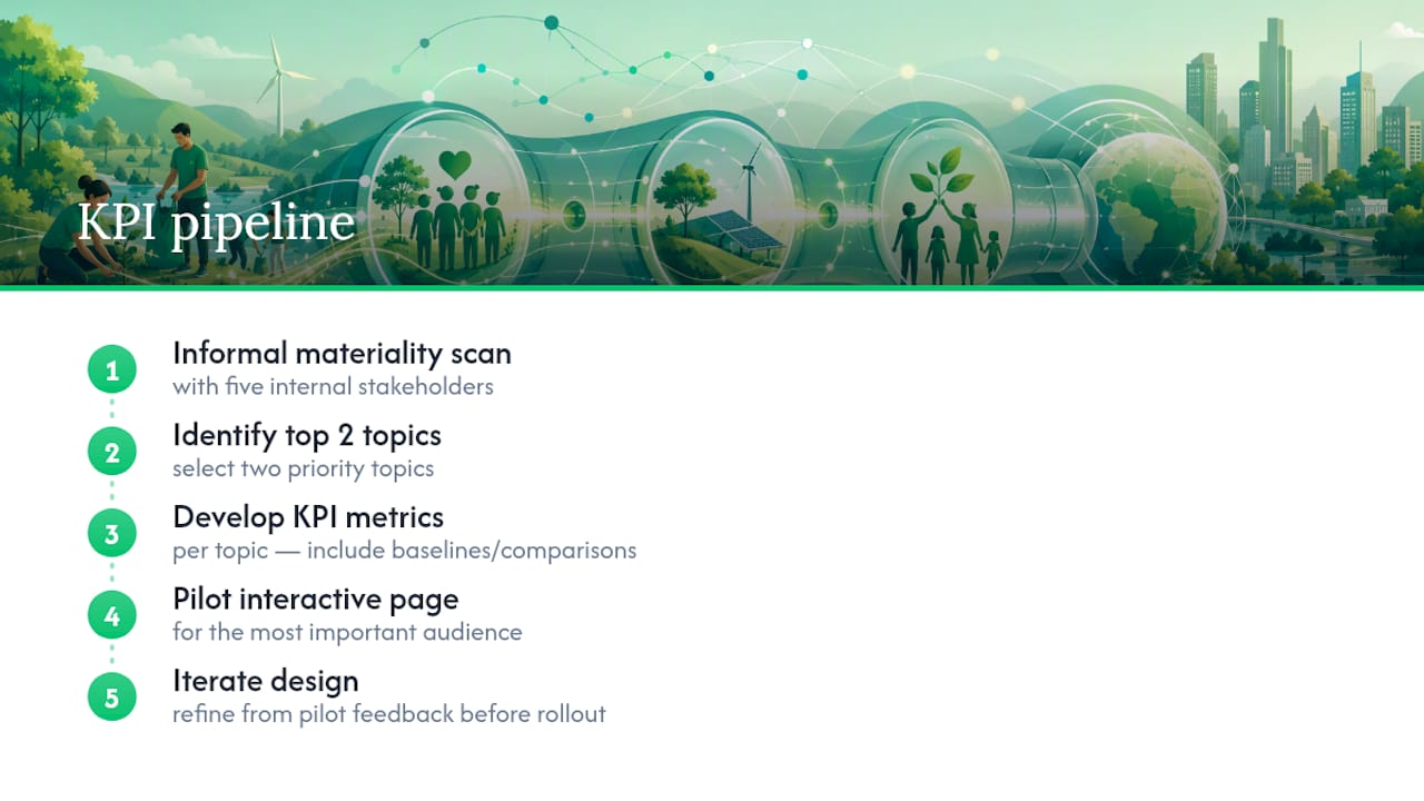
On governance, the fastest approvals I’ve seen come from companies that assign one data owner per metric early, before the writing starts, instead of chasing numbers down during final review. That single decision saves weeks.
The biggest trap is mistaking activity for impact. A list of volunteer hours or program sign-ups feels productive to publish, but it doesn’t answer what changed for anyone. Run every metric through the Five-Question Test before it goes in the report. If a number can’t survive that test, it needs a baseline and a beneficiary story attached to it, or it doesn’t belong in the report yet.
— Gene
Turn Employee Movement Into a Reportable CSR Line Item
Most CSR programs generate soft, hard-to-verify activity data. Charitymiles is built differently: every mile ties to a specific employee, a specific charity, and a specific dollar amount, which gives you a clean evidence chain instead of a vague participation survey.
The Employee Empowerment Program lets your company set the sponsorship rate per mile, cap total spend, and choose whether funds go to employee-selected charities or a company cause, all while producing participation, mileage, and donation data you can drop straight into a performance-indicators section. Start by reviewing the Employee Empowerment Program for corporations page, or check the pilot playbook if you want a structured way to launch a first challenge and start generating reportable data this quarter.
Where to Go Next for Frameworks and Templates
Bookmark these before you start drafting. GRI Standards remain the most complete reference for disclosure topics across environmental, social, and governance categories. Sopact’s guidance walks through applying the Five-Question Test to your own draft metrics. Maglr’s impact report gallery is the fastest way to see modern design patterns in action, and Salesforce’s FY26 report and Amazon’s sustainability report remain the two clearest worked examples of framework alignment paired with real assurance at scale.
Sources
- Corporate sustainability reporting — what makes it effective (HBS Library Working Knowledge)
- Salesforce impact reports and policies (Salesforce FY26 example)
- Impact report examples and interactive design guidance (Maglr)
- Social impact report guidance and examples (Sopact)
- Global Reporting Initiative (GRI) standards